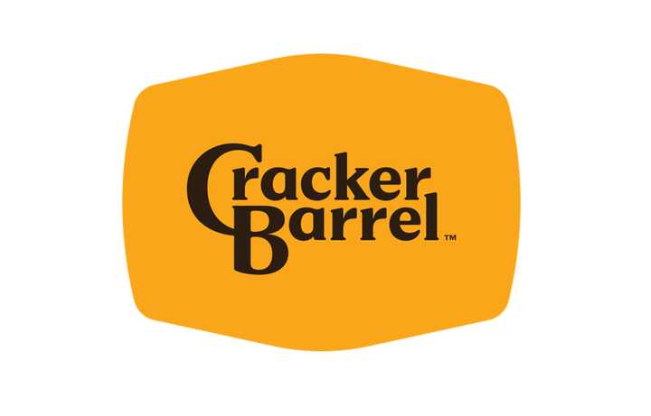
I’m confused. The new logo is great, or it’s shit, I don’t care. But what does it have to do with wokeness? Did the old man sitting by the barrel start sucking dick on the billboard? Has he transitioned? Does the new logo secretly spell out black lives matter in invisible ink? It’s just the name in a sort of blob? How is this political? What am I missing here?
They took the orange man off their logo. This is obviously a statement against Trump and therefore woke.
Woke doesn’t mean anything specific more, it just means “thing I don’t like.” So when somebody says they want to end wokeness, they mean they want to remove everything they don’t personally approve of.
But what does it have to do with wokeness?
See this handy guide for the way these dipshits think.
Snowflakes getting their feelings hurt because pictures change
Perhaps he feels the original logo depicted a white cishet male, and thus the new one is erasure.
Come-on everybody knows that barrel is full of dildos pickled in anal lube.
and where might i find a cracker barrel so i can know to, uh, avoid it and get directions away from there.
No, that would be my nightstand drawer
When I think of fixtures, I think of Cracker Barrel, too! Because I spent about 2.5 days staring at my bathroom fixtures expelling demonic essences from my bowels after contracting food born illness from a meal I ate there.
What kind of food do they have? Other than barrels full of crackers
The one time I went like a decade or two ago they had barrels full of candy I’m their gift shops though. So at least there are barrels.
Were the candies cracker shaped?
Looks like American/Southern food: https://www.crackerbarrel.com/menu
It’s like decent cafeteria food.
Southern comfort foods such as the Chicken-fried Steak
It’s kind of a southern homestyle restaurant. So, like, you can get fancy grits and country fried steak and biscuits and gravy.
All these black people thinking Trump will help their careers 😂
Do we know if this is a real person or an AI “black person”?
Did you go to his twitter? It’s a different handle.
Neither. It’s a white conservative piece of shit pretending to be a minority. It’s been around far longer than “AI”.
This guy is a republican congressman. Definitely a real black guy.
Either way, there is a well estbalished history of conservative dipshits pretending to be minorities on social media that support conservative ideals.
His twitter handle is different.
That wasn’t Jesus in the parking lot, man.
Sure it was. But it’s spelled Jesús, and he was just an immigrant trying to make a better life for him and his family back home in Mexico.
Another chapter in “Everything i do not like is woke”
The new design is minimalistic slop, for sure. But why would i give a fuck about a companies logo. Honestly we should not even be reacting to this bait.
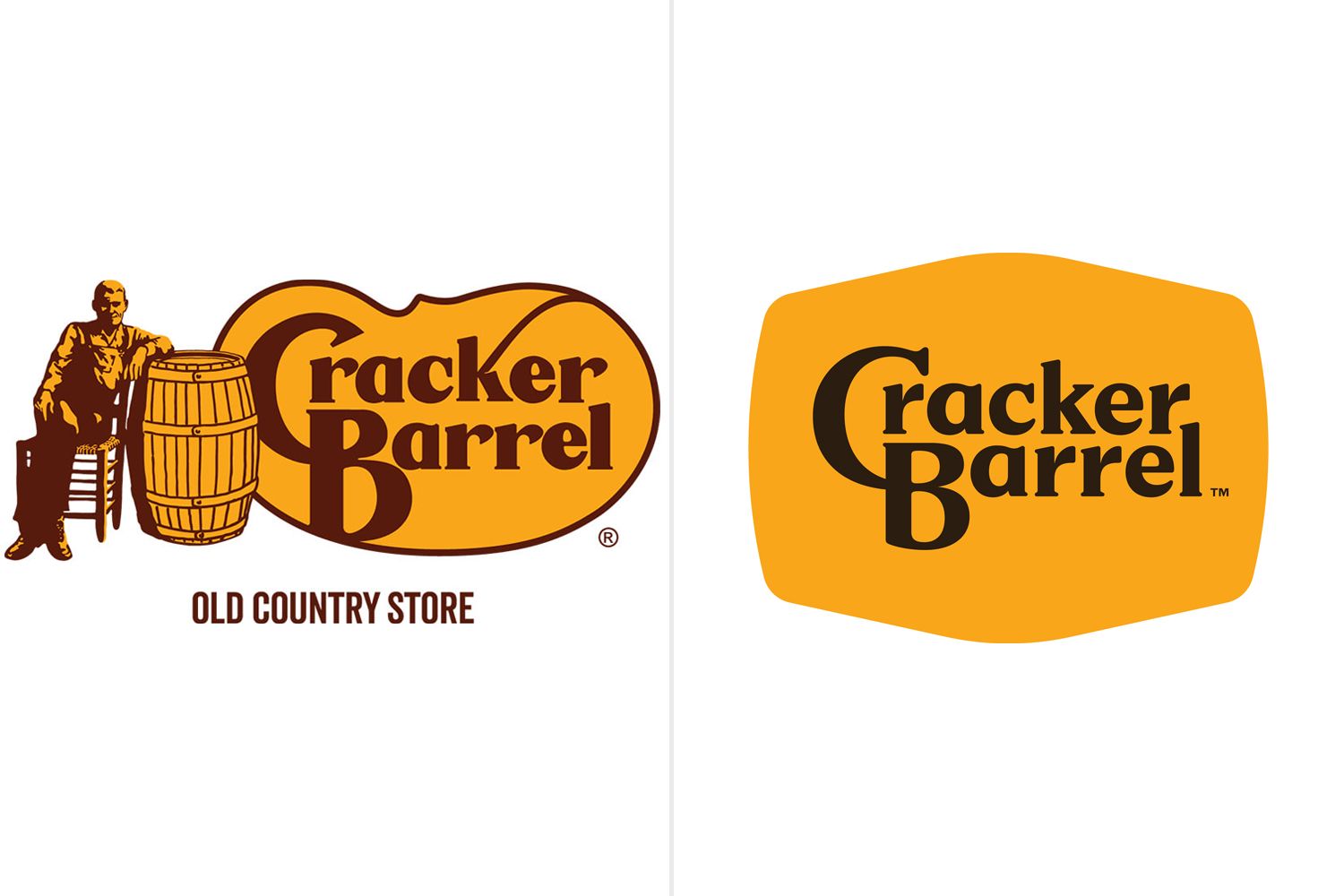
I’m not an American and I’ve only seen this logo a couple of time but I’ll be completely honest - this remodel fucking sucks.
I despise minimalism and these transitions from oldschool cool to these post-modernist corporate garbage. And that’s definitely one.
Removed by mod
If they had removed the old timer and the barrel but left the asymmetrical shape behind the text just as it was, then they might have been on to something.
I really like the geezer with his drum to be frank!
what that’s why everyone is bitching about it? like THAT?? how is that “going woke”? i guess woke is when you sans-serif.
I never said it’s going woke, don’t throw me into that box.
i didn’t say you were; i was referring to everyone on twitter claiming it was
I mean it still has serifs its just losing the old guy, the barrel, the outline and the flourish on the K
Honestly, I can see why an old guy with his hand in a barrel might be off putting for a restaurant theme
I agree with that last part. The serifs did shrink quite a bit though and Rs are completely lost them.
Its woke because they took the cracker off. They are erasing crackers
Logo matches the food now, it’s perfect.
I hate it as well, my theory is that it’s done for better readability on small screens such as phones.
I think a lot of minimalism is coming from the point of accessibility in general. Shit used to be too convoluted.
“Utter woke nonsense” - Some boomer
deleted by creator
They are getting rid of the old school Americana vibe they had.
I don’t get it because it’s "old school Americana"tm. It’s a fucking national company. If you really care about old school americana you would be visiting local diners that have been established for decades, not some incorporated theme park of a restaurant. I can’t take anyone serious that’s upset about this.
It’s all the kitschy stuff that gave it a sense if self and without that it’s a crappy chain diner.
IDK if anyone should be apoplectic over this but I get why some feel a loss due to this change.
I guess it’s even weirder for me because this is the only kind of group that would complain about something like this with all of the people in the scene going crazy over it. If Hot-topic changed it’s store appearance, I wouldn’t expect to see NOFX coming out making statements. Some people might gripe for nostalgia but they’re still selling the same shit and the corporate stores were never the actual true spirit of the scene.
I think some people look at their local chain diner the way some look at their local mom and pop restaurant and have nostalgic ties to that time/place. Not everyone lives in God’s Land, New Jersey, and has a plethora of actual diners to go to.
Suppose that could be the case. I live in an area which still has some mom and pop places (or at least are locally owned and operated) but that’s being shortsighted in regards to the rest of the American states as I’ve traveled less in my older years.
I feel very opposite and really appreciate the minimalist in this case. I don’t always, but I just don’t think the old logo was aesthetically pleasing at all.
Conservatives crying buckets of tears over a corporation’s new logo is my kink.
The heraldry of corporate feudalism is no laughing matter for capitalist serfs.
The new logo is definitely worse, I’ll give them that.
Just typical corporate mediocrity.
And someone probably got paid thousands for that new logo.
The new one
He was right. Jesus would never tolerate this. Time to flip some barrels.
It’s on like Donkey Kong!
I mean, it’s less visually noisy, but that’s it?
This dude’s willing to go to arms over this?
It makes the size of the logo versus the text look like nothing but wasted space. Hell, versus the text portion, it looks like MORE extra space is used than the old logo, ony with zero charm or familiarity to show for it.
If they wanted to re-brand as a truck-stop, merge with Love’s, don’t just rip-off their color-scheme minus the Heart.
Lmao they got rid of the cracker and the barrel
The barrel is still there. The background is a barrel.
I thought it was a cracker.
Ugh I can just SMELL the WOKENESS. If I look at this ANY LONGER I might be AWOKENED
What? How is this any « woke » even for the MAGA lunatics ??
Anything they dont like is “woke”
They had a DEI/nondiscrimination campaign because of several high profile stories where restaurants were accused of racism (black diners being asked to move away from seats visible from the entrance, at least one black person being told “we don’t serve your kind” or words to that effect.)

Tbf the old logo is much better
Yeah, I think so too. I don’t see why they had to change the font, at least the C had character. Now it’s the most boring plain forgettable font imaginable and black at that. It’s like they didn’t even try.
It’s better in some ways, worse in others. It’s shit for a thumbnail, for example. The old one stand out more, but the new one is more readable and fits into any format.
It’s following the modern trend of flat clean lines. I’m getting rather sick of it TBH
I absolutely hate basically everything about modern logos and UI design. It looks like shit, and for UIs it’s not even efficient usually.
soulless minimalism
How do you give your life to Christ in a parking lot?
I remember getting on my knees for Jesus in the cracker barrel parking lot.
Life made so much more sense once his warm love filled me.
~To each their own.~
Is it supposed to read like he got banged in the ass for some crackers or am I just fucked in the head?
So now American corporations have to get permission from MAGA to change their logo?
I’m about to expand my business from a tourist city to a big HCOL city, and I want to rebrand it in the new city, with a new name and logo. Do I need to apply for MAGA permission first? Does Don Jr have to sign off first?
What a pathetic fucking culture.
Super pathetic.
This is such a stupid “controversy.” I highly doubt that a company that has built itself on being old style southern has gone “woke,” they just adjusted their logo - like EVERY OTHER corporation in America.
Look at the big Pylon outside of your local shopping center, the one with all the store logos listed on it. Nearly all of them are basically the same - their name inside of a rectangle. The only differences are the variables like the font, the font color, the background color, borders, drop shadows, etc. And that’s it, just the company name in some font, in some color, on a background color. Things like hand-written fonts (Coca-Cola, Ford), odd shapes (Chevrolet), mascots (the Cracker Barrel Geezer), etc., are all out these days.
In fact, Cracker Barrel’s new logo goes a little outside the norm with the odd shape.
This is just a corporation doing what corporations do. Why is this any of MAGA’s business?