I’ve never given it a single thought.
I don’t mind in this case
deleted by creator
Free porn site. Nothing too radical.
ha!
Another aficionado, I see.
It’s not just ugly, it’s against the spec. The quiet zone is meant to be 4 “dots” wide on all sides for the code to be optimally readable.
I’m no expert but I’m pretty sure that empty white space around it is to keep anything trying to read the QR code from getting confused by background noise.
I’m saving this for later, I have people send me print ads (yeah really) and this will help.
Its oddly offputting 😂
The white space is too big IMO, it should be one or two squares at most. Both of the examples look really bad.
Spec says 4.
The ones without the border can look good depending on design. but often look cheap
It needs a frame, yeah.
You can’t circumcise the QR code man!
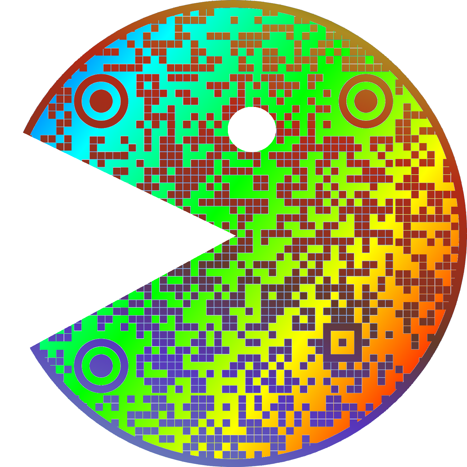
Does it really scan when both timing patterns (zebra stripes between the three corner “squares”) are interrupted?
I recommend using a dedicated qr scanner instead of google lens, because even if it can scan qr codes, it isn’t optimised for it. Sometimes it can’t even detect a medium-sized qr code in a screenshot, and it looks like they haven’t even implemented the full standard.
Here’s a pretty good qr-reader I can recommend: https://play.google.com/store/apps/details?id=com.blogspot.aeioulabs.barcode
Not open source, which is a red flag for me. There are QR scanner&generator apps on F-Droid, and you can check the source code that they do NOT send the scan result to some server and do NOT sneakily take a pic of you with the front camera.
Here is what you should do for security around QR codes.
In cases when privacy isn’t important (here, Google can match my Google and Lemmy usernames, and I leave a public comment), you can use Google Lens (in browser!) and crop the area of focus, and it works for QR codes on bent surfaces.
I have been using the one I use for 10 years, but the one you sent looks pretty good too. Being open source is a green flag for me too, when I started using mine there were no good open-source qr-readers, that’s why I went with this one.
Not even Google Lens can scan it
Might be you, I just used lens to check the QR code man and it detected it just fine on my pixel 8.
I’m not sure if a hardware barcode scanner would like it but Google Lens can read it just fine.
I like your username
Cursed image
I think that the white space is actually part of the protocol?
deleted by creator
The error correction isn’t enough to overcome a bad background?
My memories of the early days of designing these things for ad clients (we’re talking 2010-11) were that like 20% “damage” was allowed before scanning became difficult. So of course my art director wanted to put cutesy shit all over them to be “unique”.
I just didn’t want the client to ask when it didn’t work because their phones didn’t like them.
People like your art director are the reason people like my product manager want us to write code to verify QR codes, so that our clients can tell their clients that they forgot the quiet zone and their client’s clients may have trouble reading the code.
Damn that’s a lot of levels of clients.
Error correction helps a scanner account for portions of the code being obscured/unreadable, whereas a bad background can make a code not even recognizable as a code in the first place. (depending on the algorithm used, how bad it is, yadda yadda)
It is.
I am watching veritasium last vid on how qr codes work as we speak
Lol this exact video is what prompted me to make the meme
It is - without the quiet zone, it makes detecting the locator pattern really difficult, especially in one’s looking for the 1:1:3:1:1 ratio.
I helped my wife make a qr code quilt (it says “quilt”). There wasn’t quite enough border around it, and you can get it to scan, but it’s not super reliable.
My current bugbear with QR codes is that lots of folks have started putting their company logo in the middle of the code.
Sure it still works but it makes the error correction work harder so your users need to be nearer or have better cameras than they would otherwise. Annoying.
I hate that so much. Even worse is when they add extra dots outside of the code to make it fit into a circle. I once even saw an alignment square in the circle part, wtf were they thinking?
I mean you could also increase the error correction rate without increasing the company logo size.
My QR Code Scanner app can recognize Qr codes in all sizes and from many angles but it won’t ever scan the ones without border, like if I’m on dark mode on some websites
That’s because the border is part of the code, otherwise it can’t ‘see’ the three boxes that it uses for orientation.
iPhone can figure it out without the border ¯\_(ツ)_/¯
Without the border, it just looks like one of those minecrafts kids are always going on about.
It feels constricted, almost suffocating.


