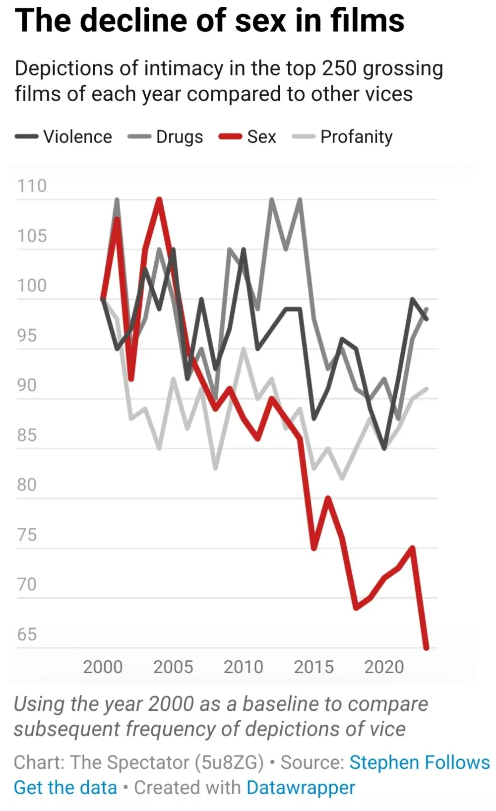
I wouldn’t call it dishonest. The label says that it’s (value) in every 250 movies (the 250 highest grossing of each year), so if the graph (which goes from 65 to 110) actually showed the whole 0 to 255 values, forget seeing such a stark difference, it would probably be hard to distinguish each line. Putting the whole 250 values and getting a ton of blank space would also be redundant, taking into account that the values change between 65-110.
Thus, not dishonest, but I do admit that before you look at the scale it might look like gibberish. Sex scenes have obviously not gone completely extinct in the last few years.

Dishonest graph, the y axis goes from 65 to around 100, rather than starting at 0
Don’t know why you got voted down. It’s true and it’s the first thing I noticed about the graph
I wouldn’t call it dishonest. The label says that it’s (value) in every 250 movies (the 250 highest grossing of each year), so if the graph (which goes from 65 to 110) actually showed the whole 0 to 255 values, forget seeing such a stark difference, it would probably be hard to distinguish each line. Putting the whole 250 values and getting a ton of blank space would also be redundant, taking into account that the values change between 65-110.
Thus, not dishonest, but I do admit that before you look at the scale it might look like gibberish. Sex scenes have obviously not gone completely extinct in the last few years.