- cross-posted to:
- [email protected]
- cross-posted to:
- [email protected]
You must log in or register to comment.
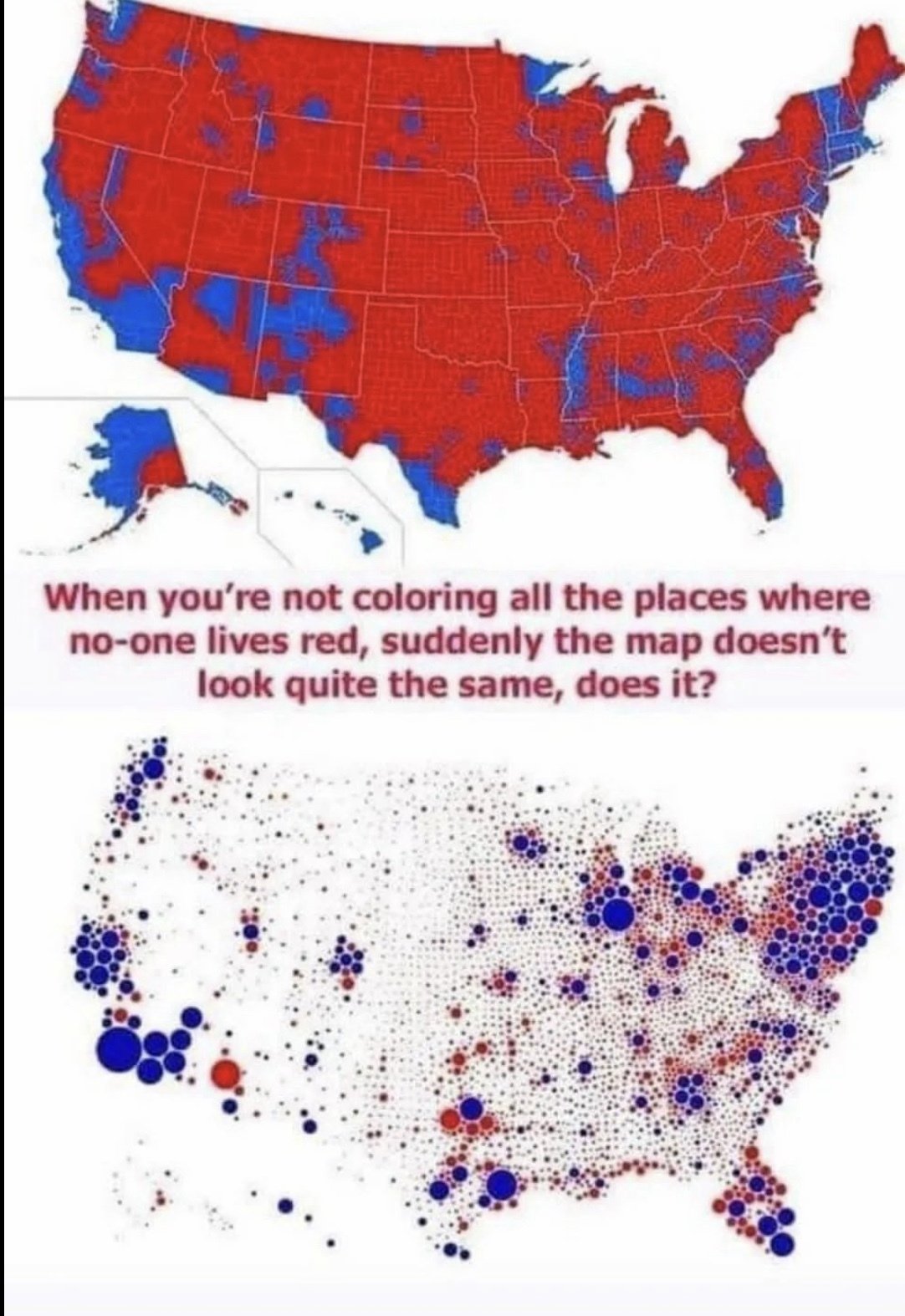
I doubt anyone will disagree with me but “look at how red this map is” is the stupidest arguement.
Last year after ana election my dad reposted a map on Facebook like this but for the single issue on our states ballot. The comment from the original poster was something like liberal cities decided this all counties need representation. Of course the counties that weren’t blue were mostly populated by cows.
But like seriously this was a direct popular vote on a single issue you can’t get a more representative election than that one.
My favorite thing to do with these people is to ask them “okay, would it be alright if these issues were decided on a per-county basis then?”, if they say no they’ve outed themselves as just wanting to hold as much control over others as possible from a minority position, if they say yes ask again but with individual towns, if they say yes to that, then you narrow it down to individual people, then they tend to get mad when they realize what you’ve done
then you narrow it down to individual people, then they tend to get mad when they realize what you’ve done
That’s anarchocapitalism…
Yep. There are currently three heavy biases favoring the rural population. -senate (by design) -the house --not by design, but because the representation was capped at 435. It hasn’t grown with population and thus a citizen in Wyoming gets more representation than a citizen in California (or Texas for that matter) -the presidency by virtue of the above two being biased.
Fix house apportionment, let the Senate be the safeguard, and the presidency will have a very slight protection by nature of the electors via what matches the Senate.
This is all in line with the framing of the Constitution, but it gives up power to “the bad guys” (aka the actual majority)
there’s no lying like lying with maps
(for those ggr nerds, yes, “the map was a lie”)
Especially Google maps, they persuaded my friend to turn right and now he thinks corporations are people.
never considered online service maps much as political maps, but of course they are. What gets mapped as POI tells people what they are to find interesting and what not vice versa.
Cartography is super cool.
Invariant of the day: In any square mile of the USA, there are 25 Republican voters, the rest of them either vote Democrat or not at all.
It doesn’t work of course. Suffolk County, MA (Boston) has a partial pressure of about 1kGOP/mi2. Nevertheless, it’s closer than you might expect considering how many square miles don’t even have 25 human beings.
In my head I read that as “one kiloGOP per square mile”
That’s what he wrote.
Why he had to mix metric and freedom units, though, I don’t understand.
Just a few hundred miliGOPs is enough to fuck up a city council.
Must determine the hazardous ppm of GOPs in the water
Zero tolerance
We need to get the EPA on this. It’s pollution.
When this baby hits one point one kiloGOPs we’re gunna see some serious shit
Ah so elections should be a piece of cake then!
Presidential? Yea you would think. But seeing this map overlayed with districting lines would help explain how we get some of our senators representatives we have.
Districting lines have nothing to do with Senate elections - senators are whole state affairs. Districting lines only affect two things at the federal level - House elections and presidential electors in two particular states that grant one elector based on the results within each House district and two based on overall state vote.
Good luck trying to get an American conservative to understand what the second map represents. I means hit, they refuse to grasp the concept of “per capita” because they know it makes them look bad.
gasp Are you suggesting, good sir, that republiQans may in fact not be arguing a particular point in good faith???
NO! I cannot believe it.
Issue with this (because of first past the post) there are still a significant number of people voting the opposite way of who wins in their electorate, for the most part.
Thank you
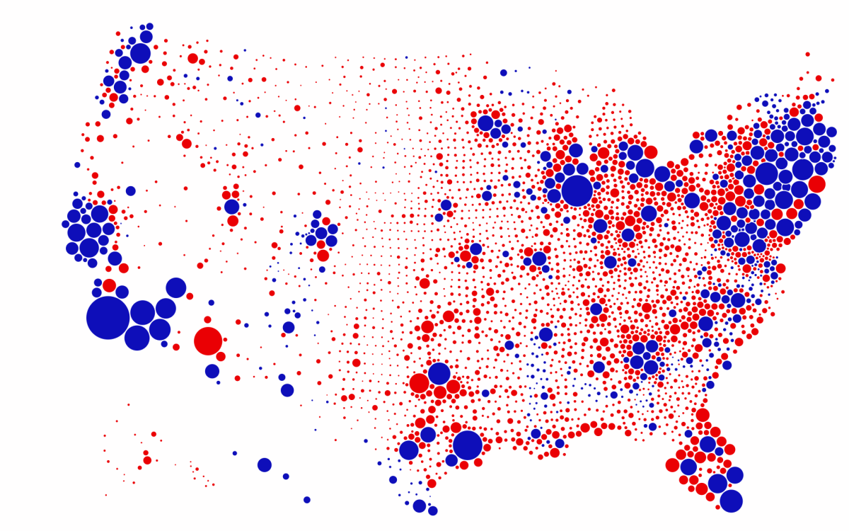
What’s the medium sized red dot just north of LA? I live around there and it makes sense but there’s a lot of small-ish towns around here and I don’t know what it represents. What population patterns do these dots represent? I’m guessing the red dot is either Visalia, Tulare County, San Joaquin Valley in general, or Fresno.
The dots are counties - the largest red one above LA is Kern county - Tulare county is the smaller red dot above it to the right
This is a clearer version of that map. The other two much smaller red dots above LA are Kings and Inyo counties - this map is based on 2016 presidential results, as Inyo went blue in 2020 (by only 14 votes though)
I don’t know that there’s a lot of sand in Kansas.
There’s a whole lot of dumbass rednecks though.
Hey now, the KS governor just vetoed some bullshit anti-abortion stuff. Somehow.
But yes, KS is a poster child for letting right-wing idiocy run rampant.
All I know was the last time I was in Kansas City, MO, which was many years ago, the people I was with would yell, get back to Kansas if a car drove by with a Bush Jr. bumper sticker.
Missouri is even more fukt than Kansas, ironically.
Having only ever been to Kansas City and Fulton, I couldn’t say. But I did read What’s the Matter With Kansas? years ago. I’m sure it hasn’t substantially changed since that book came out.
https://en.wikipedia.org/wiki/What's_the_Matter_with_Kansas%3F_(book)
I think it actually has. My understanding is the KS GOP so thoroughly fucked the state that they started to lose support from generational voters.
All the hospitals closed, economics got worse, big agri bought everyone, etc.
But they still run most of the state, so, that’s not saying much.
Any improvement over what’s in that book is good.
If like 200,000 move to Wyoming it could flip. I have seen people bring it up numerous times but no one acted on it.
Because it would mean living in Wyoming.
Don’t threaten me with a good time.
How come they always color the places that don’t have anybody there as red?
Why can’t blue take it?
Because of the way the US handles elections.
Here’s a link to my other comment that explains it as I (a laymen) understand it as I was taught in school.
Keep in mind both of these maps are grossly misleading. Or at least one is being presented in a misleading way.
One is just coloring an entire county the way the majority voted. This is why those huge (land) counties are all red, because at least 1 more person in it votes for trump than Biden (presumably, I don’t know what the map is actually based on but it’s a safe bet). So that’s why “the sand” is regularly colored red. Although saying noone lives these is misleading.
Which leads me to the second map is probably a noble effort to show some population scale, by reducing all of the counties to a circle the relative size of their population, but it’s being misrepresented here as if that’s where all of the people in those counties live, which is certainly false. Just look at the center of the country, it’s basically a grid of small dots. Do people honestly think the population is distributed like that?
The most frustrating thing about this is everyone in this thread is complaining about how Republicans are too stupid to understand why the map is colored the way it is…while being absolutely fooled as to why the other map is the way it is.
Possibly because unless you have an eight figure trust fund the GOP doesn’t help you, so if you vote Republican you are stupid?
Apparently, hating dumb Republicans doesn’t preclude you from being dumb yourself. Imagine that
Oh man, you got me so good. You forgot to tell me how your dad can beat up my dad.
It’s funny because my point was based off of what you actually said, your’s was just a mindless childish insult… ironically accusing me of making childish retorts.
It’s funny how much you see what you hate about yourself in other people.
The most frustrating thing about this is everyone in this thread is complaining about how Republicans are too stupid to understand why the map is colored the way it is…while being absolutely fooled as to why the other map is the way it is.
Fwiw I don’t think anyone’s “fooled” by the first map. Or (again, imo) that all republiQans are too stupid to understand why sand doesn’t vote.
I do think the first map is regularly used as a right-wing talking point by individuals and corporate news to “explain” how republiQans must be winning elections, and that explanation is false. Presumably many of the individuals and all corporate news organizations know that. Which is why it’s just straight-up propaganda.
My point is that the second map, at least the way it is being framed in this meme, is equally misleading.
What it is presumably showing is dot in the middle of each county (although clearly not in middle for places like the NE that are being pushed apart, but I think it’s true for like kansas/nebraska) that is scaled relative to the population of that county. It’s not necessarily where the people in that county live.
I get that Republicans use the former map to deceive and spread propaganda. What I’m pointing out is that is exactly what is happening with the way the second map is being framed in this meme. It’s pure absurdity for people to fall hook, line, and sinker for it. . .while shitting on the intelligence of people who fell hook, line, and sinker for another map being presented in a misleading way.
Oh right - well, again fwiw, I doubt people are lead to believe that midwest populations are laid out in perfect order like that.
Hm. That said, most midwest towns are laid out in some kind of grid. But that’s more about transportation than politics.
Probably because 40 out of the 50 voters in those counties voted red.
They are probably coloring whole counties, where the second map just makes a dot for each country proportional to population.
Thank you for actually understanding what the second map says. It’s shocking how many people in these comments were so easily fooled into thinking that is where the people live in the second map.
The other complication is that the second map is so potato you can’t see what color the smaller dots are and I think it gives overall a bluer impression than it would at higher quality.
It’s the same reason all around the world: India, China, Australia, Venezuela, Romania, Kenya: Hicks.
Hicks are everywhere. And they vote for regressive authoritarians for any number of reasons, most of them wrong.
I love classism
Oh there you go bringing class into it again
Again?
Fear… Humans have an evolutionary and natural fear of the unknown… If you live way out in the middle of nowhere, pretty much everything outside your tiny bubble is unknown, and therefore scary. Then assholes come in and use that fear to their advantage. “Everything you’re afraid of IS horrible and out to get you! Vote for me and I’ll protect you”
Blue has abandoned anything outside cities. Their outreach is basically move to a city, which unsurprisingly isn’t popular there.
According to you: they abandoned things outside cities, so they’re not popular outside of cities???
Lol tell me you’re ignorant without telling me you’re ignorant.
Question: do you think the MAJORITY of people should decide how they’re governed?
And that’s aside from the obvious fact that red team is currently pushing a convicted felon seditious child raping traitor as their defacto king?
Well Biden just stepped down from the elections
I loved finding this out from a random comment on Lemmy. The interweb’s still got it!
https://www.nytimes.com/interactive/2020/10/30/opinion/election-results-maps.html
https://purplestatesofamerica.org/
Yall should read How to Lie with Maps.
So the NYT wants to tell us we’re not as polarized as the maps may show?
Of course they do. Both Sides, you know. Other than that, the points about colors are well taken, it’s just so on-brand for NYT to have the editorial POV that everything’s normal, it’s fine.
I hate sand
It’s coarse and rough, and it votes Republican


