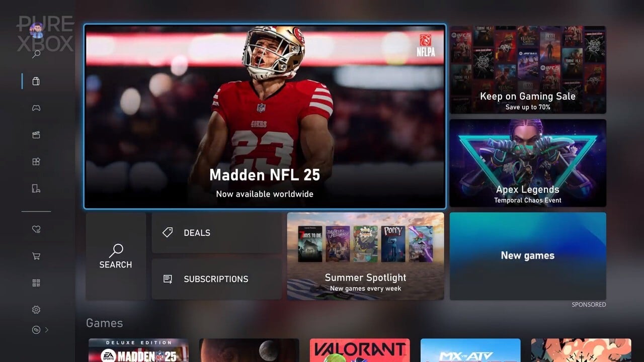
We have a few ideas in mind.
The Xbox Store (or the “Microsoft Store” if you want to call it that) is a place that we’re constantly browsing on a near-daily basis here at Pure Xbox, and it’s obviously a crucial part of the console (and PC) experience for all players.
This is the place you go to buy new games, buy them on discount, check out the Free Play Days offerings every week, subscribe to the likes of Xbox Game Pass and Ubisoft+, download apps, look for free-to-play titles, and so much more.
Screenshots and videos of games aren’t intuitive or easily playable with on-screen controls.
Also if you are a Game Pass subscriber it showed the cost to buy on the screen instead of just a download option for a game that’s in GP (on the browsing screen, not when clicking into the game)
Would love to be able to sort by price, not just alphabet.
I have had two major issues lately that were either limited to me or actual issues that should be addressed:
- Gamepass game trailers are not pre-buffering so they are insanely blurry until they load fully. Hard to get someone to think a game looks like fun to play if it looks blurry for the first 10-15 seconds of the game
- Gamepass game search closed on me six times mid-typing a game I was looking for. Incredibly frustrating to type in 3 letters and it drop me back to the dashboard


