

From this article:
https://inrng.com/2025/07/tour-de-france-2025-review/
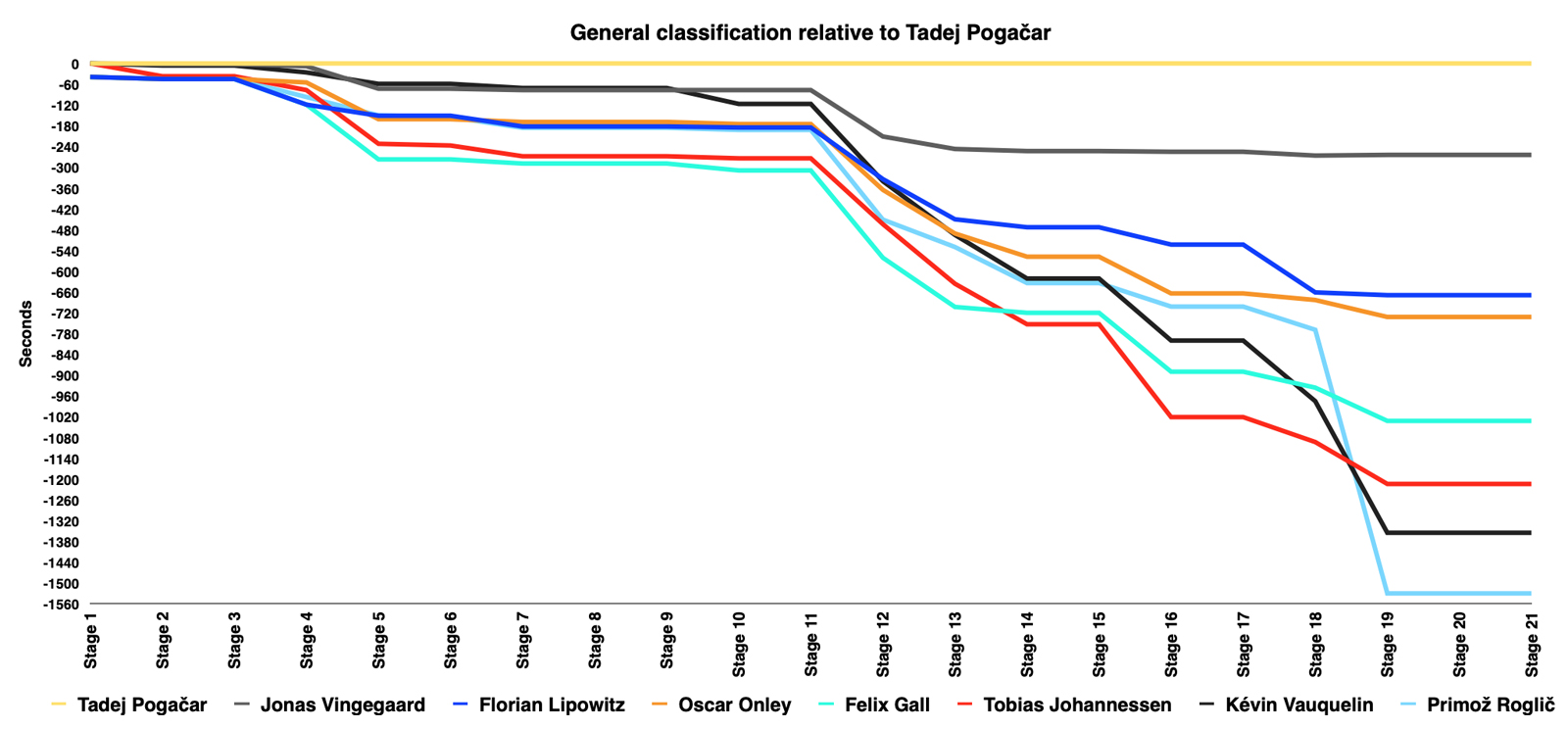
I like this view to show how the others fell off, over time.
From this article:
https://inrng.com/2025/07/tour-de-france-2025-review/
I like this view to show how the others fell off, over time.
Fun graph. It would be cool to see this for the whole peloton. Is the data easily and publicly available?