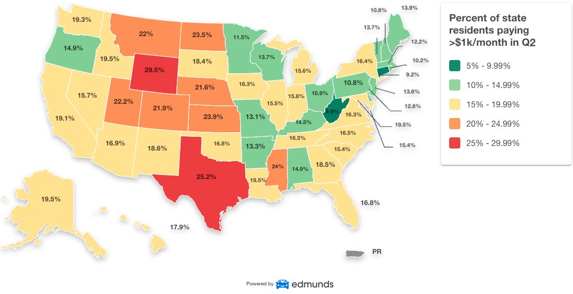
So color coding tells us 15 - 19% of people paying more than $1000/m is normal or the edge. I guess this decision is arbitrary, so I suggest a one-dimensional color scale.
It is likely representative of the statistics that form the graph, so how about instead of randomly inventing an entirely new representation we stick to color coded percentage buckets.