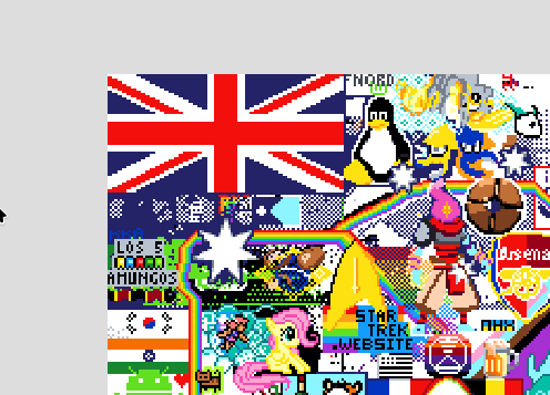
Why? There is no peepo on the canvas and there is no space left to draw. The UK have already a big flag on top-left:

You can help us by using this template: https://canvas.fediverse.events/#x=621&y=259&zoom=8&tu=https%3A%2F%2Flemy.lol%2Fpictrs%2Fimage%2F6efeae75-9642-4383-902a-cc271693b9c2.webp&tw=60&tx=595&ty=220&ts=DOTTED_BIG
Don’t be a dick. There’s plenty of space on the right side where the canvas expanded, and that flag at the top left is not the UK, it’s the Union Jack on the Australian flag.
ETA: And the new one doesn’t even appear to be a UK flag, it looks like it’s an England flag.
Maybe we can draw under England flag? They have white background anyways :) There’s not enough place left though, all of them have a draft drawn.
If you look at the left hand side, or even the Australia flag you screen shotted, notice that items are either small or overlapping. It’s ok to pick a spot, and then only build your template to the edge of the things around you. Here’s an example:

It looks much nicer having things poked in gaps and working together on the clashes rather than everyone building in their own space and leaving white in between.


